Tuesday, 29 September 2015
UNIT 2 Final Evaluation
Final Evaluation

 During this project I have learnt how to gray scale, duo tone,
level and use different lighting. I have also learnt how to crop my images to a
certain size; this has also made me think of how I take my photos because I
would keep in mind how it would look when the image would be cropped. In each task I had learnt how to do the tasks
set which were to learn how to duo tone, gray scale and level my images. The most
effective task I think was the different types of lighting situations I could
use when taking photos indoors and outdoors. In every task I made sure to do a
step by step so therefore it would be easier for me to remember. In every task
I learnt something different which helped me grasp a better understanding on
photography in a general sense. For example when I learned how to duo tone this
helped me understand how to bring more color out in my images.
I would say the most effective task for me was the different
kinds of lighting which were artificial, natural, both natural and artificial
and the copy stand. This was the most important to me because it helped my
photos have a different type of aesthetic than before. Almost every task I
tried to explore fully. Every task that I have completed has helped me develop
my understanding and the way I edit my photos. This has benefited me because
it has given me a peace of mind when taking and editing my photos. Each task
has development my knowledge greatly when thinking about taking a photo and has
also made me improve my editing skills. I think that editing a photo and using
techniques in photography is beneficial to both aspects when editing and capturing
a photo. I think that editing definitely plays a big part when producing an
image and so does using techniques when taking the photos.
Speaking of techniques in photography, cropping was one of
our tasks that you could either take in to account when taking a photo or not.
When I took my photos I did a mixture of both to see how my pictures would be
affected. For instance when I didn’t take in to account that the pictures would
be cropped to a certain length I lost a lot of the photos essence. Although
when I did use the technique I captured the photos essence more effectively. On
the photo shoot I experienced things such as lens flare and when shooting in
manual the lighting would be everywhere. This was a problem for some of my
shots so I had to use a lens hood and auto focus in some of my pictures because
of the lighting problem.
When researching I took images from the internet and
magazines to get a general look of how the colors would look together (RGB,
CMYK). It also helped me when organizing the images together because it gave me
a general look at how my color grid would look later on such as using a
certain pattern. When I edited my final photos for both the RGB and CMYK I
wanted to make them stand out individually by having them look bold and
colorful. This also would help my final photos look aesthetically pleasing
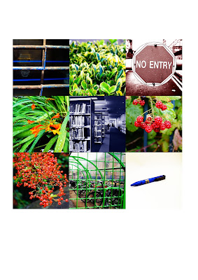
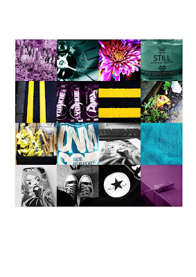
because of how the colors popped. My RGB final photos have a general theme
which is nature and my CMYK has the theme of using outdoor and indoor items
with also a touch of nature. Overall I think my images are effective to the
theme of RGB and CMYK. If I had to improve any of the tasks I have done so far
it would be the photo shoot because I would have liked to had more outdoor
shots and another thing I would have liked to improve was the cropping because
although in some photos I took I knew they would be cropped some other photos
had lost key parts of the image because I had forgotten that all of the photos
would have been cropped to the same size which were 6 cm x 6 cm or 4.5 cm x
4.5 cm.
Tuesday, 22 September 2015
UNIT 2 Lighting
Natural Light
Natural light is where you use the sunshine as your only source of light. The reason I chose to take the photo above from this direction was because the natural light was facing my object, this makes the object stand out more than it would if the sun was in my picture. If i were to take it from the opposite angle the sun would have over powered the object causing it to appear darker than the object actually is.
The photo below was also taken with
natural light but this was taken indoors only using the natural light that was
shining through the window behind my object. I also edited this photo in
gray scale to give it more of a dramatic effect. This photo works well because
the light is shining in and bouncing off various objects in this room.
Artificial Light
Artificial light is using the light given in a room. These photos were taking indoors using only the artificial light in those rooms. The angle I took at the photo above was head on because I thought it was more appropriate to use this angle than any other angle. This photo has not been edited. The photo below was also taken with artificial light. The reason I chose to take the picture at this angle was because the artificial light above was show casing the books below and everything around the room. This photo was also not edited.
Natural & Artificial Light
Natural and artificial light is using both the light provided by the sun and the lights in a room. These photos were taken using natural and artificial light. Both pictures contrasts and brightness was edited in Photoshop. The picture above’s angle is taken at the right side to capture the incoming light from the left and to also capture the light bouncing off from the lights above. The picture above however is taken at a high angle as if you are looking down at the object.
Copy Stand
A copy stand is used to obtain images that are either large or fragile. The copy stand has two lights that project on to a canvas. When you put items or an item on the canvas the light from the two lamps bounces off your object which makes the object more aesthetically pleasing when taking photos of it. The photo above has been taking at a lower right angle. The image is also compositional because of how the two items are placed. The photos levels and color has been edited to make the colors in the picture stand out more. The photo below has also been taken at a lower angle and has had its contrast and brightness edited.
UNIT 2 Evaluation
RGB
The theme of this image is the color green.This image uses natural light, the technique I used was duo tone to bring out the green in the grass. The composition of this image is also the same that i couldn't move it anywhere else. The angle of this image is low angled and is simple yet aesthetically pleasing. There is no concept to this image. This image is aesthetically pleasing because it showcases the essence of the photo which is it's color.
This image uses natural light as well as the others. I edited the brightness and contrast of this photo to bring a dark but bright feel to my image. The angle of my image is straight on. The concept of this image is that there is more than one way to do things. The composition of this object is already set because it cannot be moved around. This image is aesthetically pleasing because it shows a depth of field
CMYK
This images theme is cyan and this image uses artificial light and has not been edited. The angle of this image is from a high point and i also used flash to illuminate the inside of the object. The composition of the object was controlled by me as I had free reign to move the object around and take photos much easier. There isn't a concept to this piece.CMYK
In this image you can see that the only light used is natural light. The images angle is captured at the left of the subject to capture a depth of field. The theme of this image is the color magenta. The composition of this image is already set therefore it couldn't be moved. The aesthetic part of this photo is the brightness of the flowers.
The theme of this image is yellow and is another natural light photo. The angle of this image is facing straight on. The composition of this imaged is positioned at an angle so that it was easier to take photographs of the object. This photo doesn't have a concept. The technique of this image is the simplicity of it's color.
This image uses natural light and has been edited in gray scale to give a more dramatic effect to the image. The theme of this image is the color black. The concept of this image is to symbolize that colour isn't everything to an image that there are many other details to it. The stripes in this image are aesthetically pleasing because they are level and straight.
Subscribe to:
Comments (Atom)


