Tuesday, 15 December 2015

UNIT 35 Trip Evaluation

Trip Evaluation 

Hebden Bridge was suitable for the task because it had a varied selection of places for perspectives such as ariel, linear, forced and dwindling. I used almost all of these when taking photos and the theme of my photos was perspectives. My favourite photo I took was of a pathway leading down to the river and bridge, the angle of the photo was eye-level.One of the problems was the weather because it was difficult to take shots with all of the rain. Another problem I encountered was when my film ended short, instead of 36 shots I only was able to take 30. 

When I next do perspectives in photography I will check the weather to be more prepared and to also plan an idea of what my shots will look like. When planning before hand I had some ideas on how I was going to carry out taking perspective photos. When following through with the trip I had encountered some problems but the trip informed me on how I could improve my photos and how time management was definitely needed. Compared to usually using a digital camera I found that using a film camera was quite easy and a good change from digital. Although a downside to using a film camera in my opinion is not being able to check the shot you’ve just taken. 

I found that by using a film camera it was a nice change from using digital. I think that it made me photograph differently because i wasn’t able to check my shots therefore i planned them more than i usually would when shooting digitally. If I were to use a film camera again I would take more time in to planning my shots and also maybe use a different film. 

UNIT 35 Evaluation

Evaluation
First off we started with the brief on what perspective was and what kinds of perspectives are used in photography, we also learnt about depth of field, small apertures, focus, composition and wide angled shots. 

After that I did some research on some forced perspectives to get some inspiration on what I could do when shooting my images. we were then sent out to create our own forced perspective images.  

After I took my shots I then went on to photoshop to see how they looked and to also see if I wanted to edit them.Although I wasn’t allowed to manipulate the images considering it would defeat the whole point in getting the forced perspective right when shooting them. The things that I could’ve edited were levels and color but I chose not to because I wanted my photos to be unedited/raw.

The next task I did was a follow on from the previous task (where I learnt about the different perspectives) next I had to go out and create some perspective shots. For my aerial/atmospheric I had to create a minimum of four images 2 for each aerial/atmospheric. Overall I would take a total of 10 images for linear, dwindling and aerial. After taking my photos I had to put them on to my computer and create contact prints on photoshop.

 I also had to select my best ones from the shoot.
For the next task we learnt about film cameras, film and the darkroom. By learning this I found out about the different types of film and that we would be shooting in black and white film for our project. For the darkroom I learnt about the different type of chemicals and what the rules are in the darkroom. After the brief about film we then were given a film camera to see if we had any basic knowledge on how to use one.
 Luckily I had used a film camera before so I checked to see if there was any film in it and what the focus, aperture and depth of field was. After that Mike and Gemma explained everything about using a film camera. The first thing they taught us was how to load the film in to the camera then how to readjust the aperture, focus and depth of field.
Task 2 was research about film and the darkroom. I had to answer simple questions about film cameras like what SLR stands for and what are the main components of a film camera. Next I had to list the names of black and white film manufacturers, what sizes there were, frame counts and film that comes in different speeds.

The last part of my researched focused on the darkroom; the questions consisted on: what is the name of the red light used in the darkroom and what the main components of the enlarger are. The final part of this task was to create a timeline of the procedure I would go through when doing my photographic prints and also the procedure of my final prints.

My next task was a little task on knowing what components are on a film camera and enlarger. I had to input on the diagram what parts were on both. My next task was the trip evaluation where I had to evaluate the trip I had gone on to take my final shots for my perspectives. The first section included me saying if the location was suitable for my perspective shots and many other aesthetical things. The next section was about the technical side of taking my images. For example was it challenging to use analogue camera.

The darkroom task included me getting my film developed so I could produce the images I had taken on the trip. Firstly I did my contact prints to see how my photos would look as a whole when being produced in the darkroom. Then I did a practice print on an image to see how they would turn out as a 7 x 5 format. This is where I learnt how long I would need for the exposure of my image and how to make my borders even. 
My final prints consisted of me choosing four images and then enlarging them and developing them. This seemed easy at first but previously I had some issues with getting my borders correctly.

 Luckily after using 2 sheets of paper to test my borders I was set to go do my final images. I found that using an enlarger was pretty fun because it’s very similar to using a projector when displaying film.

After producing my images I had to scan my film in to get two of my final prints to do a comparison. The comparison would look at the differences between both versions of Images. This is where I talked about focus, darkroom settings and overall looks of the images.


My last task was an evaluation of my entire project which would look at all of my tasks I had previously completed. 

Monday, 14 December 2015

UNIT 35 Types of perspectives in photography

Types of perspectives in photography


Perspective: - The art of representing three-dimensional objects on a two dimensional surface, to give me the right impression of weight, width, height and position. 

Forced perspective is a technique that gives the illusion that an object can appear closer, farther, larger or smaller than the object is. This technique is normally used in photography, film making and architecture. Forced perspective can also be used in tourist shots for comedic effect such as when it is used with the leaning tower of Pisa or the Eiffel tower. 


Linear perspective is where parallel lines recede in to the distances to appear to get closer together or converge in to a vanishing point. Train tracks are a good example of this because you can see the tracks all the way until their vanishing point.


Dwindling perspective is when all the objects are the same size but get smaller at a distance.Things such as trees, poles, people etc are used when doing dwindling perspective.
Ariel perspective or also known as atmospheric perspective is the effect that the atmosphere has on an objects appearance when it is viewed from a distance, as the distance gets greater the contrast of the details within the object decreases. 

UNIT 35 Contextual Influences Research

Contextual Influences Research 
Unit 5:P2

Now you have been given your brief and the theme of the project you are asked to research historical and contemporary photographers.

Use the internet and the library to research black and white perspective photography. 

Find an historical (up to and including 1950s) and contemporary (1960s onwards) photographer using both research sources that has used perspective to great effect.

Find one image for each photographer and analyse the images stating how you think they have been created.

In your analysis include:
1.     How was the image taken? (Conventional or digital, long shutter speed or fast shutter speed, composition, angle).
2.     What type of perspective has been used within the image? How can you tell this?
3.     Why do you think the photographer used this particular type of perspective? (draws attention to a particular part of the image, adds importance to a subject)
4.     When was the image created? Do you think this has had an effect on the way the image was created? 
Remember to reference your work, use the table to help you. 

Image title
Photographer
Year created
Book title and shelf mark / website
Library 1 
(Historical)
Mount Fuji 
Koyo Okada 
1950
Photography & Architecture (779.72 DEM)
Library 2 
(Contemporary)

Untitled Film Still #48
Cindy Sherman
1979

The photograph as contemporary art. (770 COT)
Internet 1 
(Historical)
The Hand of Man 
Alfred Stieglitz 
1902
Inaugural issue of Camera Work.
Internet 2 
(Contemporary) 
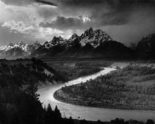
The Tetons and the Snake River
Ansel Adams 
1942
Voyager Golden Record.


UNIT 35 Camera, Film and Darkroom research

Task 2 – Camera, Film and Darkroom research  Unit 35: P1, P2


SLR stands for single lens reflex camera normally uses a mirror and prism system.  The seven main components of a film camera are focusing ring, aperture ring, shutter speed dial, Film rewind crank and knob, film advance lever, shutter release button and film speed rating.
Manufacturers such as Kodak, Fujifilm, Adox and ILFORD produce black and white film but they all sell different kinds of film such as colour negative and chromogenic.
All of these manufacturers sell a variety of different sized films from 35 to an ultra large format sheet. 35mm film comes in a variety of frame counts this is because when a moving picture is displayed each frame is flashed on a screen for a short time. Persistence of vision blends the frames together producing what is an illusion of a moving image. Film comes in different speeds because there are different effects that come with it.


 For example 400 ISO will create a high contrast and sensitivity with the film.  The higher the ISO/ASA is the faster the films and shorter exposures but by using a high ISO this may make your contrast and grain higher but the slower the film is generally better because you get more sharper and detailed images. The red light is normally referred to as safelight or red light, is used for illuminating the parts only on the visible spectrum. The main components of an enlarger are the enlarger head, film carrier, enlarger lens, elevation knob, focus knob, easel and the baseboard easel. 

Contact Prints Diagram
First you get your negatives and place them in to the contact print holder,  then you set your color settings for the enlarger head  which are:
Cyan 0
Yellow 23


Magenta 56 

You then set your aperture to 5.6 The next step is to make sure your negative holder is in the correct place. To do this you will need to press white button on the timer to show the outline of where your negatives will need to be placed. Then you add a piece of grade 3 paper underneath the negatives so that the image will print on to it.

After that you will need a piece of cardboard for the exposure to work. This means that you will produce your image in intervals I  set my timer to 10 x 3 which is 30 seconds. So my intervals will be 10 seconds each. Once the time has run out you will need to take your grade 3 paper and take it to the chemistry trays  which are labelled developer, stop, fix, and  rinse.


The developer brings up the image you have developed hence the name and it takes 1-2 minutes . The stopper is what stops the developing process from working. The fixer is just to stop the developing and stopping process and this takes 2 minutes. The last step which is rinse  cleans off all the chemicals off and takes 30 minutes. 

Final Prints Diagram 
First you select the four photos you want as your final prints. Then you set your aperture to either 5.6 or  depending on what kind of brightness you want. Then you put one of them in your film carrier , use the elevation and focus knob. After you are happy with the look of the image you then set your timer to the appropriate time and get a piece of grade 3 paper. After that you then put your paper in the developer for 30 seconds.  Then you put it in the stopper for 2 minutes and after that you put it in the fixer for 5 minutes. Then you rinse it which takes 30 minutes.


UNIT 35 Contextual Influences Research Analysis

Contextual Influences Research Analysis

The Hand of Man was conventionally taken without knowledge of shutter speeds. The composition of this shot is on the importance of the machine in the modern industrial age. The angle of this image is taken at eye level, this gives us the impression that if we were there at the time we would see the train and its surroundings the same way that it was shot.

This images perspective is atmospheric because as you can see in the photo that the buildings in the background look as if they are fading away, this is probably due to the smoke around the train yard or the weather at that current time.
Stieglitz used this type of perspective to show that a gritty urban landscape can be turned in to an atmospheric beauty instead of the usual unspoiled landscape that other photographers would usually use at the time.

The image was taken in 1902 and published in the inaugural issue of camera work in 1903. I think at the time the photo was taken it definitely had an effect on the image because the method that it was produced was photogravure which is when a negative is transferred to a metal plate and is then etched in. This means that it would take a long time to develop and that the quality of the image wouldn't turn out good. 
The Tetons and the Snake River was conventionally taken and as of the era didn’t know anything about shutter speeds. The composition of this is focused on the landscape instead of just focusing on a specific part in an image. The angle of this image is a mix between eye level and a bird’s eye view this is because the photo is taken high up. The perspective used in this image is Ariel/atmospheric because the mountains contrast is changing the further the distance they are from the camera. 

I think Ansel Adams used this perspective to show the different contrasts between all of the scenery in the image. This image was shot in 1942 and in 1942 there wasn’t little if any camera equipment and this image were produced with the zone system which is a method for determining the exposure and development for film photography.


Mount Fuji was conventionally shot and had a slow shutter speed even though most of the photos taken in the 50s were high shutter speeds as they had just been discovered. The composition for this photo was the mountains and everything surrounding them. The angle of this shot was at a low level and the perspective of this shot was atmospheric due to the mountains fading in the background.

 I think that Koyo Okada wanted you to see how tall Mount Fuji actually was and he also managed to capture some of the river below. This image was created circa 1950s and I think the way the photo was developed definitely affects the image. Looking at the original image it doesn’t look black and white it actually looks like a sepia filter was added on to it. 


Untitled film still #48 was conventionally shot in 1979 and reprinted in 1998. This image conceived of a slow shutter speed. The composition of this photo is of a woman looking out at the scenery in front of her. Normally when having a subject in a shot you try to put all focus on them and not the person's surroundings, although this image captures both together beautifully. The angle of this shot is at eye-level as you can tell by looking at the model.

 The perspective of this image is atmospheric because you can see mountains in the distance fading away. Cindy Sherman wanted to resemble moments in film at the time, she did this by dressing her models in vintage clothes, wigs and makeup. She did this to create a varied range of female personae which she then photographed in unguarded moments of reflection. This image was shot in 1979, this was one of the sixty nine untitled stills Sherman shot between 1977-1980, for the time period the image gives the image a grainy feel.


UNIT 35 Diagrams

Diagrams

Monday, 9 November 2015

UNIT 3 Comparing and Evaluation Part 1

Comparing and Evaluation


 This is my original image from my computer screen. This is how it’s supposed to look when being printed out at ProAm and printed.


This is my laser printed version of my album cover. The quality of this print compared to the computer screen is worse, the background of the image specifically because it looks more out of focus than it actually is. The highlights are also represented worse because the light that reflects off this record is much brighter than the original. 


 The shadows are brighter compared to the computer screen. The original image shows different shades of black but in the print it looks like the record blends in with the black background. The paper quality of this image is very weak and not durable at all meaning that you get marks on the image which makes it look worse. Compared to the image on screen this print looks like a completely different image. 


This is the ProAm print of my image. In comparison to the laser print and computer screen this is by far the best version. The sharpness quality of this print is much better than the laser print and is almost identical to the computer screened version. 

The highlights and shadows show much more clearly than the laser print; and also shows the reflection of the light perfectly. Compared to the laser print the paper quality is better because it is more durable although due to its glossy finish can show finger prints easily. In conclusion this is the best print and in comparison to the computer screen it looks the exact same. 


This is my original image from my computer; this is how it’s supposed to look when being printed out at ProAm and when using the laser printer.


This is my laser printed version of my print. The quality of this print compared to my computer screen is at a lower quality, the original image compared to this print is very different because when printed out on A3 the image looks like it has been stretched out.  The highlights of this image are of a decent quality but do not show all of them. With the shadows as well, as you can see on my computer screen the shadows are very visible but when printed out the shadows are darker. The paper quality of this image is terrible because the ink seeps through the paper and is not very durable.  


This is my ProAm print of my original album cover, In comparison to the laser print this is the best print of both. The quality of this paper is far better because it is durable and the quality of the image looks almost identical to my original image on my computer. The highlights of this image are much better than the laser print and the shadows have also improved a lot more on this print.  In conclusion compared to the laser print this ProAm print is much better.


Tuesday, 3 November 2015

UNIT 3 Evaluation

UNIT 3 Evaluation

The first task we did for unit 3 was research, this was on the most 3 popular decades in history; 1960’s, 70’s and 80’s. For the research we had to create a visual diary for each of the decades. This included musicians, photographers and the fashion from them. We had to use two or more sources for our research which included us using the library and internet.
 The next task included me having to choose two of the three decades that I had previously researched. 
The terms to this was that I had to select at least one band/musician for each decade. The next part of this task was to find the albums that they had created in the decades that I had chosen, I had to select one for each decade and create an album cover for each of them. I then had to list the songs from both of the albums and put them next to the albums art cover. My choice was Queens Live Killers and Journey’s Greatest Hits.

 My next task was ideas and planning, this consisted of me planning out what time I would shoot, what props I would use, what lighting would be shot and the location of each shoot. This helped a great deal especially when shooting because all I had to do was shoot the way I planned. My next task included me doing risk assessments for each of my shoots. For example the kind of risks I would have in each of the environments that I would shoot in.
Task 3a was to edit our photos for the 12” vinyl covers that we had shot previously. This was probably one of the easier tasks because all I had to do was crop my images to 12”x12”. 
Task 3b was about typography, which is the art and technique of arranging type to make written language readable, legible and appealing when displayed. This was another research task in which I had to research and analyse four or more type of fonts/typography for each of my two chosen decades. For this task I used the website www.fontsinuse.com and www.dafont.com for both of my decades. I created a list of four for each of my decades; I tried to either find them or find ones similar to the typography used in those decades with photoshop.

Task 4 I had to research and write about photographers from the 60’s, 70’s and 80’s. The word count was set at 500 words or above for this task. I had to also write about the key issues as well around the time of those decades; such as the miner’s strike or the Vietnam War.  For my final task I had to prepare my images for ProAm. This meant I had to change the resolution from 300 dpi to 402 dpi so that it could be printed out properly. After that I had to convert my files profile to Fuji_DP2_Proam.icm and set the jpegs quality to 8. Then I sent my images to ProAm to be printed out. 
 
Task 5 is comparing and evaluating my images. In this case I had to look at both of my images, one from ProAm and another from the laser printer. I had to evaluate both images and had to compare their highlights, shadows, colour reproduction, quality and paper quality also.  After that I had to do my evaluation which is this. In conclusion all tasks were fairly easy to complete but I have learnt something in all of them.


Tuesday, 6 October 2015

UNIT 3 Wednesday Task

70s & 80s

Songs from this album:-


  • We Will Rock You
  • Let Me Entertain You
  • Death On Two Legs
  • Killer Queen
  • Bicycle Race
  • I'm In Love With My Car
  • Get Down, Make Love
  • You're My Best Friend
  • Now I'm Here
  • Dreamer's Ball
  • Love Of My Life
  • '39
  • Keep Yourself Alive
  • Don't Stop Me Now
  • Spread Your Wings
  • Brighton Rock
  • Bohemian Rhapsody 
  • Tie Your Mother Down
  • Sheer Heart Attack
  • We Are The Champions 
  • God Save The Queen 


Songs from this album:-
  • Only The Young
  • Don't Stop Believin' 
  • Wheel In The Sky 
  • Faithfully
  • I'll Be Alright Without You
  • Any way You Want It 
  • Ask The Lonely 
  • Who's Crying Now 
  • Lights 
  • Lovin' Touchin' Squeezin'
  • Open Arms
  • Girl Can't Help It
  • Send Her My Love
  • Be Good To Yourself ' 


Tuesday, 29 September 2015

UNIT 2 Copy Stand Contact Sheet


UNIT 2 Artificial Light Contact Sheet


UNIT 2 Natural and Artificial Contact Sheets


UNIT 2 CMYK Contact Sheet


UNIT 2 Natural Light


UNIT 2 Contact Sheet RGB


UNIT 2 Final Evaluation


Final Evaluation

During this project I have learnt how to gray scale, duo tone, level and use different lighting. I have also learnt how to crop my images to a certain size; this has also made me think of how I take my photos because I would keep in mind how it would look when the image would be cropped.  In each task I had learnt how to do the tasks set which were to learn how to duo tone, gray scale and level my images. The most effective task I think was the different types of lighting situations I could use when taking photos indoors and outdoors. In every task I made sure to do a step by step so therefore it would be easier for me to remember. In every task I learnt something different which helped me grasp a better understanding on photography in a general sense. For example when I learned how to duo tone this helped me understand how to bring more color out in my images.

I would say the most effective task for me was the different kinds of lighting which were artificial, natural, both natural and artificial and the copy stand. This was the most important to me because it helped my photos have a different type of aesthetic than before. Almost every task I tried to explore fully. Every task that I have completed has helped me develop my understanding and the way I edit my photos. This has benefited me because it has given me a peace of mind when taking and editing my photos. Each task has development my knowledge greatly when thinking about taking a photo and has also made me improve my editing skills. I think that editing a photo and using techniques in photography is beneficial to both aspects when editing and capturing a photo. I think that editing definitely plays a big part when producing an image and so does using techniques when taking the photos.

Speaking of techniques in photography, cropping was one of our tasks that you could either take in to account when taking a photo or not. When I took my photos I did a mixture of both to see how my pictures would be affected. For instance when I didn’t take in to account that the pictures would be cropped to a certain length I lost a lot of the photos essence. Although when I did use the technique I captured the photos essence more effectively. On the photo shoot I experienced things such as lens flare and when shooting in manual the lighting would be everywhere. This was a problem for some of my shots so I had to use a lens hood and auto focus in some of my pictures because of the lighting problem.

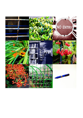
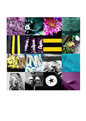
When researching I took images from the internet and magazines to get a general look of how the colors would look together (RGB, CMYK). It also helped me when organizing the images together because it gave me a general look at how my color grid would look later on such as using a certain pattern. When I edited my final photos for both the RGB and CMYK I wanted to make them stand out individually by having them look bold and colorful. This also would help my final photos look aesthetically pleasing because of how the colors popped. My RGB final photos have a general theme which is nature and my CMYK has the theme of using outdoor and indoor items with also a touch of nature. Overall I think my images are effective to the theme of RGB and CMYK. If I had to improve any of the tasks I have done so far it would be the photo shoot because I would have liked to had more outdoor shots and another thing I would have liked to improve was the cropping because although in some photos I took I knew they would be cropped some other photos had lost key parts of the image because I had forgotten that all of the photos would have been cropped to the same size which were 6 cm x 6 cm or 4.5 cm x 4.5 cm.